Michael
Kronenberg Interview, December 2015
 |
| Michael Kronenberg |
Michael: I went to school at the Atlanta
College of Art. I went to college to be a fine artist. I was a printmaker, and
a painting major. After graduating, I was represented by a few galleries. My
lithographs are in the permanent collection of the Pushkin Museum in Moscow,
Georgetown University Library, and the International Monetary Fund. I
eventually had a one-man show in Washington, D.C., so my intention was never to
be a graphic designer, I always wanted to be a fine artist.
 |
| Boxing lithograph by Michael Kronenberg currently in various permanent art collections. |
But,
I had to pay the bills. So, I started cold-calling graphic design studios and
basically lied and told them “Yeah, I have experience in graphic design” and I
was lucky enough to learn on the job.
I
was obsessed with comics, books, and magazines as a kid. In 1995, I started a
classic horror magazine with a friend. That’s when I started to really explore
what I could do creatively in graphic design. The magazine is titled Monsters From the Vault. It’s had a successful run of 20
years. When I got the chance to start doing something that I enjoyed, I began
expressing my creativity more in graphic design. I was able to give the
magazine a different appearance from all the other horror/movie fan magazines.
It looked more like a professional magazine.
 |
| Michael's cover design for the final issue of Monsters From the Vault. |
In
2002, I got in touch with (EC curator and comic book authority) Russ Cochran.
He hired me as art director/designer for his magazine Comic Book Marketplace. That allowed me to design articles
about the stuff I grew up with. I’ve always been a comic book fan. I grew up in
the ’70s, so Jim Steranko, Neal Adams, Bernie Wrightson, and Paul Gulacy were
tremendous influences.
Russ’s
knowledge of comics was pretty much restricted to EC and newspaper strips, so
he didn’t know much about the “Silver Age” and “Bronze Age” of comics. He ended
up relying on my knowledge for issue themes and what creators to talk to, and
feature.
I
got the opportunity to interview and meet people like (comic book icons) Bernie
Wrightston, Will Eisner, Alex Ross, and Neal Adams. I became an artist as an
eight-year old kid because of Neal.
After
Comic Book Marketplace, I started working on the EC Archives with Russ, which were hardcover,
full color reprints of EC Comics in chronological order. Not only was I in
charge of the books’ design, I also oversaw the re-coloring of all the stories.
I received a Harvey Award for my design on those books. Not long after that, I
connected with a friend who is an editor at Marvel. He hired me as a freelance
designer for Marvel, working on their Marvel Spotlight series and special content for
comics and graphic novels.
Backtracking
a little, in 2004, I became good friends with Paul Gulacy, who redefined Marvel
Comics in the ’70s with his work on Master of Kung Fu. I wanted to do a book on Paul’s
career. That ended up being a high-end art book titled Spies, Vixens, and Masters of
Kung Fu, published
by Vanguard Productions. That was the first book I ever wrote and designed.
 |
| Michael's book on the career of comic book artist Paul Gulacy. |
NEAL
ADAMS
Monte:
I’m also a big Neal Adams Fan. What attracted you to his work?
 |
| Batman #232 |
Michael: I was eight, and loved to draw, and
my parents saw that I had some talent, so they always encouraged me. I was at a
7-11 in Miami, and I saw the comic that changed my life, I think all comic book
fans have one of those. It was Batman #232, the first appearance of Ra’s Al Ghul. I had never
seen Batman drawn like that before and I couldn’t believe it. That was the
first time I ever looked to see who drew a comic.
That
comic had great content: The introduction of a memorable villain and Batman and
Robin’s origins. It changed the way I perceived Batman. He looked dark and
frightening. I started copying Neal’s art, and I definitely learned from that.
He was such a big influence on me.
The
darkness of Neal Adams’ Batman comics are probably one of the reasons I became
attracted to film noir. I never cared for the 1960s television show. That’s
always been kind of a pain to me. I disliked what it did to the character and
the camp baggage that it brought. One of the reasons I did the Batman book that
I wrote with Michael Eury – The Batcave Companion – was that I wanted to show how
Neal Adams – and writer Denny O’Neill – were really the ones that moved Batman
away from the Adam West-era, and took him back to his darker Pulp roots of
1939. Frank Miller has received a lot of credit for this. I like Frank Miller's Batman,
but I was always peeved that Miller was getting the credit when it was Neal
Adams in the late-1960s and ‘70s who revived Batman as the “Dark Knight.”
 |
| The wraparound cover for the Batman book Michael co-authored and designed. |
While
I worked on Comic Book Marketplace in 2003, I got the chance to interview Neal Adams. I went to
New York and spent two days with him. There had been many other interviews with
Neal about his career, but what interested me most was his work on Batman. So,
I decided to focus strictly on the Batman stories he drew. I asked Neal
questions that I wanted to know, what I always wondered about regarding those
Batman stories. For me, it was very memorable. Here I was talking to Neal in
his art studio for two days about Batman. The interview I did with Neal is
reprinted in The Batcave Companion.
 |
| Michael's interview with Batman artist Neal Adams. |
Monte:
Neal Adams also drew the seminal Green Lantern/Green Arrow comics in the early 1970s. Were you influenced by these as well?
Michael: I was a little too young to
completely grasp the political and sociological ramifications of those comics.
It wasn’t until I was a little older that I went back, bought the back issues
and realized how important they were. After I read them and being an idealistic
young man, I loved those stories. I reread GL/GA in the 1990s and thought they were
a little dated, but considering what’s currently going on in our country those
comics have become very relative again.
| The conclusion to Green Lantern/Green Arrow #76. |
Michael: The race and poverty problems that
they dealt with are all relevant today.
Monte:
They weren’t really about Green Lantern and Green Arrow per se. Those two were
the vehicle that was chosen to bring out these amazing stories.
Michael: Right. What’s interesting is that those stories were very much like Easy Rider. They had Green Lantern and Green Arrow traveling through America confronting various issues and problems in the country, just like Dennis Hopper and Peter Fonda did in their movie.
Michael: Right. What’s interesting is that those stories were very much like Easy Rider. They had Green Lantern and Green Arrow traveling through America confronting various issues and problems in the country, just like Dennis Hopper and Peter Fonda did in their movie.
Film Noir
Monte:
So while all this was going on, you started to associate with the Film Noir
Foundation, and built a pretty strong partnership with its president, Eddie
Muller.
Michael: I had been interested in film noir
since college. There was a repertory theater where I went to school that would
show double features like Double Indemnity and Out of the Past, Body and Soul and Champion.
Seeing
those movies on the big screen was fantastic. As a lithographer, WPA artists
from the Depression like Robert Riggs, John Taylor Arms, Louis Lozowick, Thomas
Hart Benton, and others heavily influenced me. Their work had that stark, black
and white, urban look, similar to film noir. That look, and storytelling –
appealed to me. Film noir looked like the WPA art, especially those pieces by
the lithographers and other printmakers.
 |
| Boxing lithograph by WPA artist Robert Riggs. |
 |
| Boxing lithograph by Michael Kronenberg. |
Michael: It goes all the way back to
childhood, and what attracted me to Batman, and the old classic black and white
horror movies. At that time, I didn’t know what Film Noir was. It was when I
got to college that I discovered what those movies were. Their appeal to me was
a natural.
Monte:
When I look at your art, you seem to capture not only the dark aspect of film
noir, but also the mood, and the feel – the style. It seems to me that is what
you are trying to capture.
Michael: Yes and also the great graphics of
movie posters, back in the day. The art of those film posters was just amazing.
I try to incorporate that into my design work. We don’t have anything like
those posters anymore.
Monte:
Orson Welles…John Alton – they seem like they just knew how to bring so much of
this out – the stories are being told just in the lighting, and the mood that
they set.
Michael: John Alton wrote a book titled Painting
With Light, that’s
exactly what he did in the movies he worked on.
Monte:
From the perspective we’re talking about, which movies do you think really
stand out?
Michael: I love the Phantom Lady, and many of the classic noir films
such as Double Indemnity, Out of the Past, Crime Wave, The Killers, Criss Cross. He Walked By Night is a John Alton film I really
enjoyed. Regarding Welles, Touch of Evil is brilliant on so many levels, I also like Lady
From Shanghai – it
might not be a great movie, but it looks terrific. Night and the City is wonderful also. There are just
too many to list, I’d be here all day.
 No
doubt, my graphic design work is inspired by not only these movies, but also
the WPA art that influenced me as a lithographer. As I mentioned before, the
visual correlation between WPA art and film noir is very strong in my mind.
No
doubt, my graphic design work is inspired by not only these movies, but also
the WPA art that influenced me as a lithographer. As I mentioned before, the
visual correlation between WPA art and film noir is very strong in my mind. My
favorite film noir is The Set-Up; it’s also my favorite boxing movie. What I love about The
Set-Up is that it’s
about the lower rung fighters, the young fighters trying to rise up and the
older fighters desperately trying to hang on. The larger than life champions,
the big names…that’s only one part of boxing. Robert Ryan’s performance is
phenomenal, even after so many viewings it still amazes and moves me.
My
favorite film noir is The Set-Up; it’s also my favorite boxing movie. What I love about The
Set-Up is that it’s
about the lower rung fighters, the young fighters trying to rise up and the
older fighters desperately trying to hang on. The larger than life champions,
the big names…that’s only one part of boxing. Robert Ryan’s performance is
phenomenal, even after so many viewings it still amazes and moves me.
The
movie that really put the film noir hook in me – the movie that got me obsessed – was Kiss Me Deadly. I love that movie. It has a comic
book feel and a great look. Ralph Meeker is absolutely perfect. You know Mickey
Spillane hated that movie. It’s nothing like his book.
Monte:
Well, he’s not the first…
Michael: Right.
CURRENT WORK WITH the Film Noir Foundation
Michael: I had been aware of the Film Noir
Foundation for several years. I was on their mailing list. Eddie Muller,
the founder and president of the FNF, sent out an Email blast to all
subscribers asking for someone to design and do the production on their
electronic newsletter called the Noir City Sentinel. He listed all the requirements for
the job, and I said to myself, “I can do that. I’m jumping on this.” I had a
full plate of work at that time but I wrote him back immediately and told him,
“I really want this job.” In fact, I kept bugging him and said, “If you don’t
give me this job, you’re gonna regret it for the rest of your life.” He told me
that he had other designers interested in the job, so I was going to have to
take a test.
I
had never taken a design test before. He sent me a story he had written about
the history of To Have and Have Not – all the various versions that had been shot. He sent me
the newsletter’s specs so I could set up a design file. I ended up giving him
three completely different designs and sent them back to him in an hour. I guess
he was impressed because I got the job.
After
working on the Sentinel newsletter, I eventually said to Eddie, “let me redesign this, and make
it into a full color digital magazine.” He gave me the green light and that’s
how the Noir City Sentinel became Noir City
e-Magazine. NOIR CITY is a fully
interactive magazine, it contains movie trailers, film clips, and music. We also have a
back issue site where you can purchase and
download all previous issues.
A
minimum $20 donation to the Film Noir Foundation gets you a year’s subscription
(four quarterly issues) to Noir City magazine. All of the donations go towards
our film restoration projects. If you love film noir, then you should consider
donating to the Film Noir Foundation.
 |
| Michael's cover designs for the Film Noir Foundation's NOIR CITY e-Magazine. |
Next
year we’ll be releasing two of our restored movies on Blu-Ray/DVD, Too Late
for Tears and Woman
on the Run.
 |
| Eddie Muller's Dark City and Dark City Dames are essential reading on both Hollywood and film noir. |
Monte:
What led Eddie to publish a book so focused on the great Gun Crazy movie?
Michael: Eddie originally wrote that book as
a companion to the Blu-Ray release of Gun Crazy in France. The book was in French.
Eddie retained the rights to publish it in English. I redesigned the book for
the English language version and Eddie released it through his new publishing
firm Black Pool Productions.
 |
| Gun Crazy star Peggy Cummins and Michael. |
It
was a wonderful experience for her and a little overwhelming. I’m not sure she
was completely aware of how beloved that movie and her performance is. She
truly enjoyed it.
My
brother Steve (co-managing editor of Noir
City magazine) and I go to the San Francisco festival each year. We were
asked to take care of Peggy while she was in San Francisco. We were at the same
hotel with her, escorted her to breakfast every morning, made sure she was
comfortable, took her to the theater, and we got to know her fairly well. She’s
so personable, sweet, and has a great sense of humor. She eventually referred
to us as “her boys!” We loved watching Gun Crazy and Curse of the Demon with her at the Castro.
 |
| Michael's cover design for Eddie Muller's book on the making of Gun Crazy. |
On
a related note…I highly recommend anyone who loves film noir to attend the Film
Noir Foundation’s upcoming film festival in San Francisco January 22-31 at the
Castro Theater. For film buffs, there’s nothing like it, the city practically
comes to a halt and seeing Eddie as host is extraordinary. And there’s a reason
Quentin Tarantino said he wanted to die at the Castro Theater, it’s a
magnificent movie palace. We always debut our newest restorations at the
festival. The movie schedule will be released on December 16. For details go here.
Wrapping Up
Monte:
It sounds like you have a dream job. All the things you loved have converged
and you must be really happy about it.
 |
| Michael's cover design for Philippe Garnier's book on author David Goodis. Published by Eddie Muller. |
 |
| Michael's cover design for Bela Lugosi in Person. Recently selected as one of the best film books of 2015. |
Michael:
I’ve recently
designed a couple of books about horror movie star Bela Lugosi for film
historian Gary Rhodes: Bela Lugosi in Person
(selected by Huffington Post as one of the best film books of
2015) and Ed Wood’s Bride of the Monster. And I just completed designing a
book on Electric Football titled Full Color Electric Football, maybe the most popular sports toy
ever made. It was the NFL’s best selling merchandise for over 20 years.
MICHAEL KRONENBERG’S 10 BEST BOXING MOVIES
My father was a New York Golden Gloves Tournament
participant and had a brief professional boxing career, so I’ve been passionate
about the Sweet Science all my life. Here are my ten favorite boxing movies.
 |
| The Set-Up. |
1 - The Set-Up (1949)
Robert Wise delivers the greatest boxing movie and its also
one of the best film noir movies ever made. The narrative unfolds in real time
(clocks are ever present). Robert Ryan’s performance transcends the noir genre
and ranks as one of the best ever and his co-star Audrey Totter is equal to the
task. To me this movie represents what boxing is all about. Seventy-three
unforgettable minutes!
2 - Raging Bull (1980)
 |
| Raging Bull |
An extraordinary movie considering director Martin
Scorsese knew nothing about boxing and star Robert DeNiro had to beg him to
make the movie. When the movie was first released, the talk almost exclusively
surrounded DeNiro’s real-life weight gain to portray an older Jake LaMotta. As
time passed, it’s now recognized as a classic and arguably the best
collaboration between Scorsese and DeNiro.
 |
| When We Were Kings |
3 - When We Were Kings (1996)
This Oscar-winning documentary explores the 1974 bout
between challenger Muhammad Ali and champion George Foreman in Zaire, Africa.
This film is about much more than the fight itself, it’s a peek into our world
during the mid-‘70s.
 |
| Body and Soul |
4 - Body and Soul (1947)
A fictionalized account of Jewish boxing great Barney Ross.
This movie was filmed by star John Garfield’s company Enterprise Productions.
It’s the best of the “fame to ruin” boxing movies. A number of the movie’s cast
and crew would eventually be Blacklisted by Hollywood, including stars
Garfield, Canada Lee, Anne Revere, and screenwriter Abraham Polonsky.
 |
| The Harder They Fall |
5 - The Harder They Fall (1956)
Based on Budd Schulberg’s novel, the fictionalized story of
one-time “Heavyweight Champion” Primo Carnera. It’s a hardcore portrayal of the
overwhelming corruption in the Fight Game. Contains numerous cameos by real
boxers. Humphrey Bogart’s final movie.
 |
| Fat City |
6 - Fat City (1972)
This was John Huston’s best movie since The African Queen and based on Leonard Gardner’s brilliant novel (he
also wrote the screenplay). Representing boxing away from the limelight: young
fighters ascending and older fighters descending.
7 - Triumph of the Spirit (1989)
A true-life survivor’s story about a Greek Olympic boxer who
fought for the amusement of Nazis at the Auschwitz Concentration Camp in order
to insure his survival and his family’s. Willem Dafoe delivers a powerful
performance in this overlooked movie.
8 - Requiem for a Heavyweight (1962)
This big screen version of Rod Serling’s story about punchy,
big-hearted, and washed-up fighter Mountain Rivera is darker and better than
the original TV version. The movie is driven by terrific performances from
Anthony Quinn, Jackie Gleason, Julie Harris, and Mickey Rooney. Also contains a
who’s who of cameos by boxing greats: Jack Dempsey, Barney Ross, Willie Pep,
and Cassius Clay (before he became Muhammad Ali) as the fighter who sends
Rivera into retirement.
9 - The Great White Hope (1970)
Based on Howard Sackler’s successful Broadway play, a
fictionalized account of Jack Johnson the first black Heavyweight Champion.
James Earl Jones brilliantly portrays Jack Jefferson, but he might as well be Jack
Johnson. The play and film came out during Muhammad Ali’s three-year exile from
boxing when he was stripped of his titles and boxing license for refusing to go
to Vietnam. As much as this story is about Johnson’s difficult plight in the
early 20th Century, it’s also allegorical to Ali’s struggles from
1967-1970.
10 - Ring of Fire: The Emile Griffith Story (2005)
This documentary tells the powerful story of six-time
Welterweight Champion Emile Griffith, the hidden life he had to lead, and
confronting the son of Benny Paret, the boxer he killed in the ring.
MICHAEL KRONENBERG’S FAVORITE FILM NOIR POSTERS
This is by no means a complete list, because there are far
too many noir posters that I love. But, here are the posters that stand out for
me. I’ve used several of these in my designs over the years. You can find the
Belgium posters I’ve listed in Eddie Muller’s upcoming postcard set coming from
Black Pool Productions. (Posters
listed in alphabetical order)
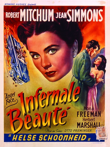
Angel Face – Belgium poster
The Big Heat - Belgium poster
Blonde Ice – Half-sheet
The Blue Dahlia – One-sheet
Gun Crazy – Three-sheet
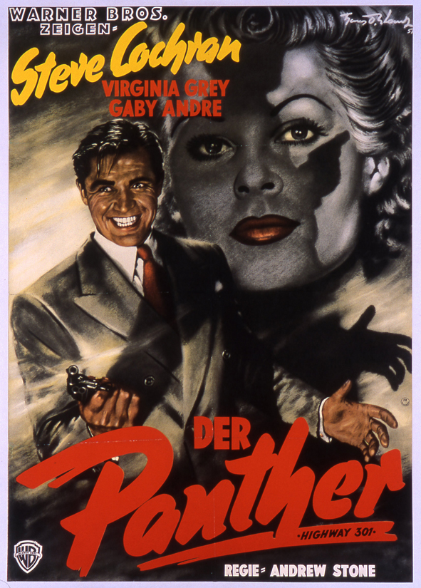
Highway 301 – German poster
The Hitch-Hiker – Three-sheet
Ministry of Fear – Six-sheet
The Narrow Margin – Italian poster
Nightmare Alley – Three-sheet and German poster
Somewhere in the Night – One-sheet
Taxi Driver – One-sheet
Touch of Evil – French poster
(scroll down to view posters)


There is no one more talented than Michael. His eye for details that most of us overlook is amazing. All of his work exudes a passion and always draws me in, even if the subject isn't well known to me. Great interview Monte!
ReplyDeleteThank you for those kind words Greg. Michael is an extraordinary talent, I agree. And I felt he was really insightful as well! He also helped me design the piece, and it really shows in the excellent layout. Neat guy!
ReplyDeleteThanks again!
Monte